Projects
Visualisations
Click this button to explore my Data Visualization projects, where I demonstrate my ability to present data visually for clear insights and storytelling.

Analysis of Air Emissions around the COVID-19 Pandemic
This project tries to understand how the COVID-19 quarantine impacted our environment. The changes in CO2 emissions and electricity usage during this period were studied. This research sheds light on the environmental side of the pandemic and points towards ways we can live more sustainably.

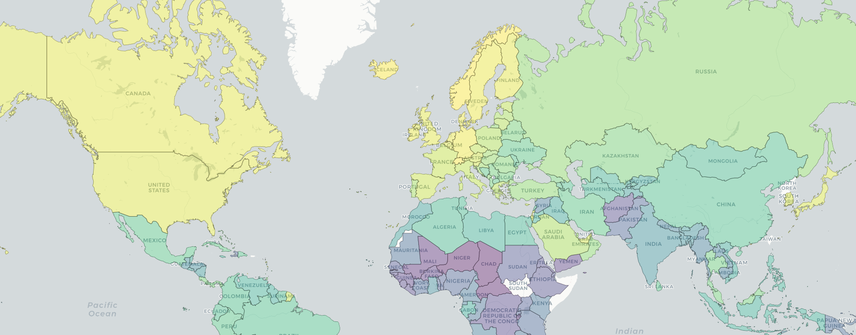
Interactive dashboard for HDI, Homicide and Suicide data
In my Masters degree research, I examined the correlations between Suicide rates, Homicide rates, and Human Development Index (HDI). To make this complex data accessible and engaging, I created a user-friendly web dashboard using Python and Dash. This interactive platform not only showcases my findings but also allows users to explore the intricate connections between societal well-being and crime rates intuitively.
NOTE: Due to this using different programming languages and structures it is hosted on the different website. Clicking on this project will open it on the new tab.
